Journal
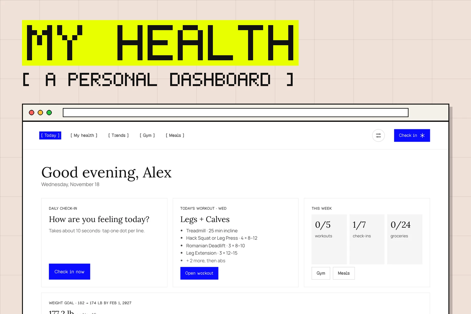
My health information lived in too many places: lab results in a patient portal, activity and sleep on my Apple Watch, workouts in my head, recipes in a dozen browser tabs. None of it talked to each other, and none of it was designed for me to actually read. So I built one page that pulls it all together.
This post is about what it does and what it changed, not my numbers. Everything personal stays on the dashboard, behind a password.
What it does
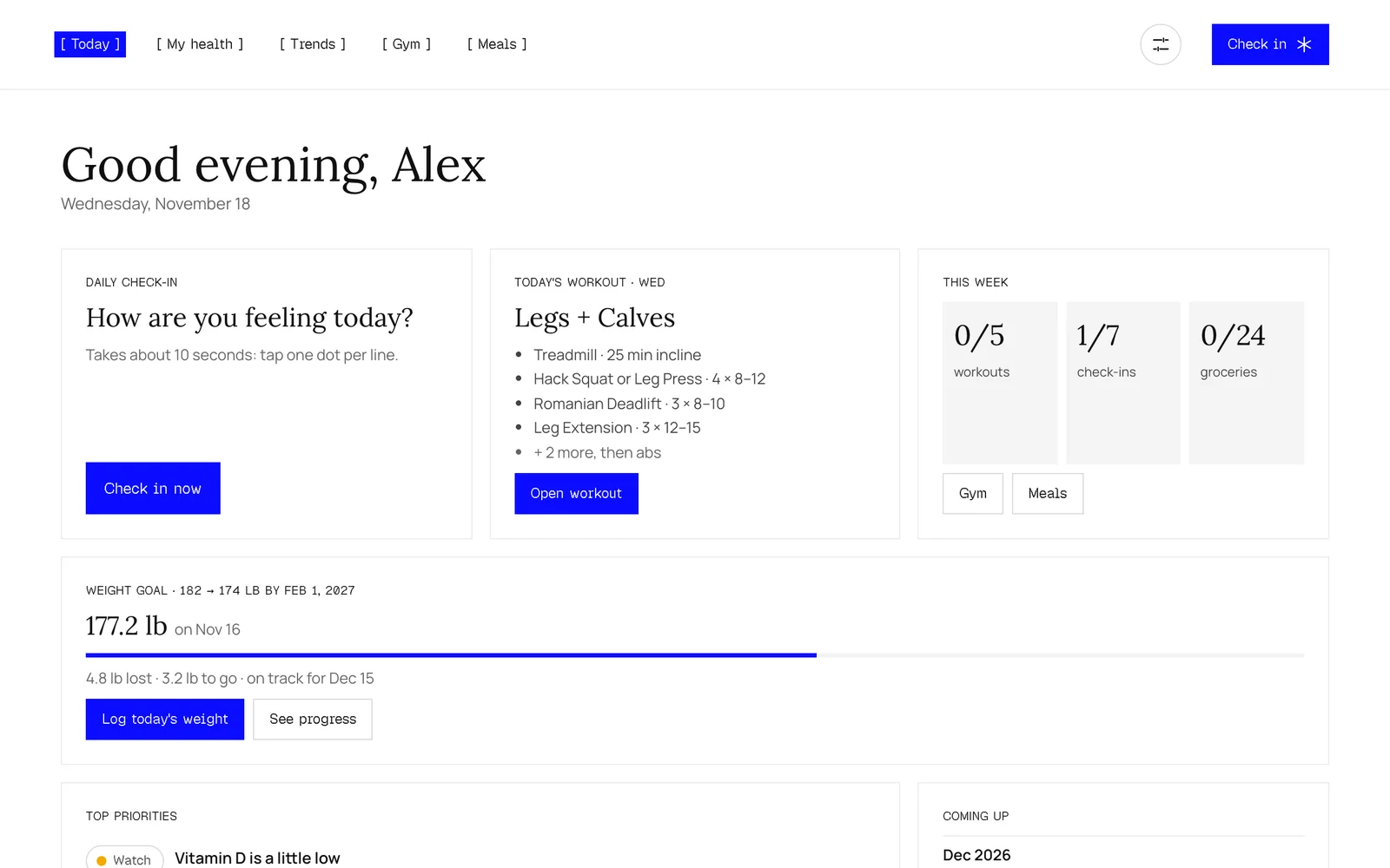
- Home: a short summary of what needs attention, each issue paired with a plain-language plan, plus upcoming follow-ups, current diagnoses and medications, and a "what's going well" list so it isn't all bad news.
- Trends: labs and vitals, activity and sleep from Apple Health (steps, resting heart rate, HRV and more), and a chart of how I've felt over time.
- Daily check-in: rate overall, energy, sleep, mood and body from 1 to 5, log my weight, add optional notes, done in seconds. It pops up once a day if I haven't done it yet.
- Gym: a weight goal with a progress bar, goal pace and projected finish date, plus a weekly workout plan that adapts itself. Each exercise rotates to an alternative every four weeks, or sooner if it stalls for three logged sessions.
- Meals: a meal directory, a weekly meal plan and a shopping list I can check off at the store.
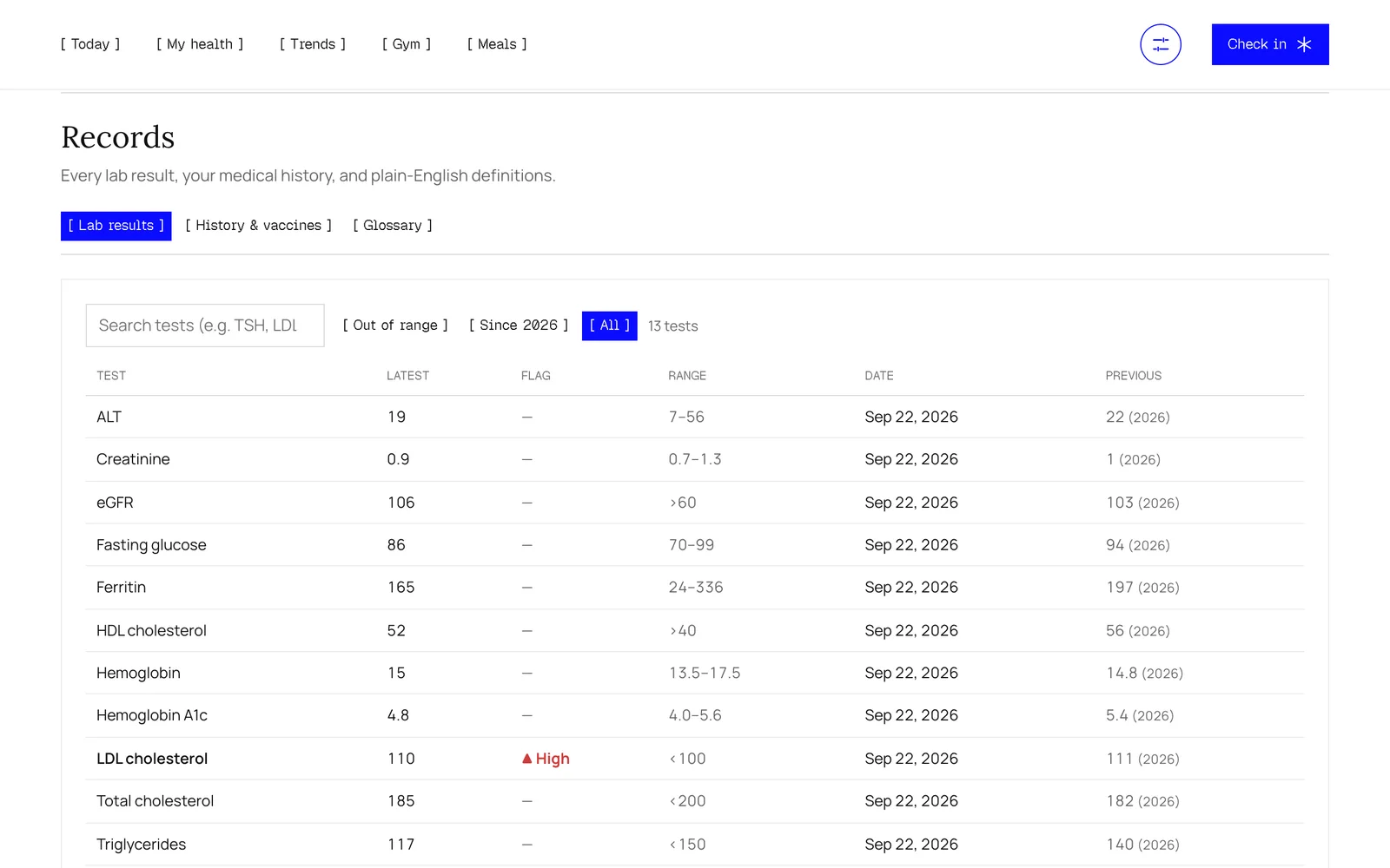
- Settings & records: my profile, weight goal and appearance, plus every lab result with an out-of-range filter, history, imaging and vaccines.
- Glossary: medical terms are underlined across the whole dashboard; tap one to see what it means in plain language.
How it's built
It's a single HTML page built from my own Apple Health export, including the clinical records my providers share with Apple Health. The type is Geist Pixel, the same as this site, and it has light and dark modes.
- Private by default: nothing loads without a password, and search engines are told not to index it.
- Installable: it can be added to my phone's home screen and opens like an app.
- Recipe import: paste a recipe link and it reads the recipe straight from the page. For sites that block that, a "Save to My Health" bookmark does the import from my own browser.
- Two ways to run it: a small Python server shares it on my home Wi-Fi, and the same thing runs on Vercel, with check-ins, the workout log and shopping-list checks saved in a small Redis database.
What it changed
- I actually understand my results. Plain-language explanations and a glossary beat a wall of numbers with red flags next to them.
- I notice patterns. Seeing sleep, activity and how I felt on the same timeline makes connections obvious that I'd never spot day to day.
- Better doctor visits. Follow-ups, questions and history are in one place, so appointments are more focused.
- Fewer decisions. The workout plan tells me what to do next, and the meal plan feeds the shopping list, so the healthy option is the easy one.
This is a personal project, not medical advice. It organizes what my doctors tell me; it doesn't replace them.